
Click to see full page screenshot
The new My eBay Beta is being shown to selected users, currently with the choice to opt out to the original My eBay. Most noticeable is the use of tabs and the vastly reduced number of links on the page. This may be slightly frustrating for some, until they learn where the links are now hidden but should make it easier to navigate once users become accustomed to the new layout
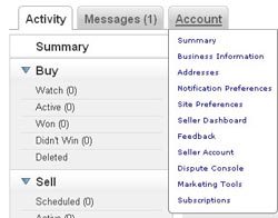 Most of the links eBay users will need are available from dropdown menus similar to the dropdown menus at the top of every eBay page. If you’re looking at the My eBay Beta, you’ll need to use these to access many of the features previously available direct from the sidebar.
The Buying and Selling tabs in My eBay Beta now have the new yellow headers for each section. Thankfully everything now appears to fit onto a 1024×768 resolution screen without the need for horizontal scrolling.
 I do like the buying suggestions offered on the summary page. Taking recent items looked at it displays a montage of products the buyer may be interested in. Hovering the mouse over a product enlarges the image and clicking brings up the product details to the left.
The new My eBay is going to take a while to get used to, but on the whole I like it. Best of all I’ve not spotted any of the obtrusive adverts that take so long to download. Hopefully with the new slimmed down sidebar they’re gone for good.
So what do you think? If you’re one of the chosen few to trial My eBay Beta do you like it? If you’ve not tried it what are your first impressions from the screenshots?



6 Responses
I think to be fair Chris there are far more pressing issue’s to address, I’m always staggered when eBay start fiddling with stuff that works and choose not to fix things that don’t.
I couldn’t give a flying duck about the new design tbh and I doubt I am in the minority.
BTW, this is no reflection on you or your opinions, after all this is a blog about eBay…. its just my view.
It’s a fair stance to take, although eBay is so large that the team that’s been working on the new My eBay (for over a year if I recall correctly) doesn’t have a remit to work on the other (possibly more important) parts of the site.
Basically they’re tasked with making this part of the site as good as possible for users… so hopefully they’ve achieved that 🙂
I just wish they would stop changing things. They seem determined to fix everything until it breaks. The amount of changes we are seeing at the moment is just way too much to cope with.
I think I belong in the flying duck camp. I don’t have time for this garbage. I was just popping in to do a price check and didn’t know where I was. Maybe I am just a grouchy old hag BUT I AM SO TIRED of things being improved.
I see they’ve moved the “Close My Account” link to be much more prominent 😆
I dont let these things bother me, I just adapt and get on with it,
no doubt folks will be squarking about this one being changed in a year or twos time