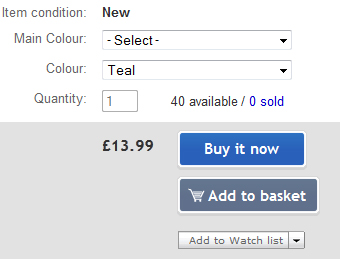
 eBay have changed the look and feel of the “Place bid”, “Buy it now”, Make offer and “Add to basket” buttons. It’s a small change but the new buttons definitely look more funky than the older style.
All the buttons are blue, with the exception of the Add to basket button which is differentiated in a steel grey colour.
This change shouldn’t make any difference to the functionality of the site, but it’s always good to see eBay making some design tweaks. Before anyone complains about eBay tinkering on minor design it’s worth saying that I’m sure they’re working on more fundamental site improvements, but someone has to work on the aesthetics and the new buttons are rather cool.


One Response
I think it’s time they made the Buy It Now button disappear altogether and put a total stop on non paying ‘buy it now’ er’s (as opposed to bidders)
🙂