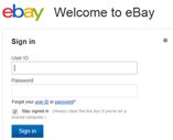
eBay are testing a new sign in page. They say that “The page reflects a more modern design and incorporates our new logo. Depending on how the test goes and community reactions, we may decide to make this a permanent change”.
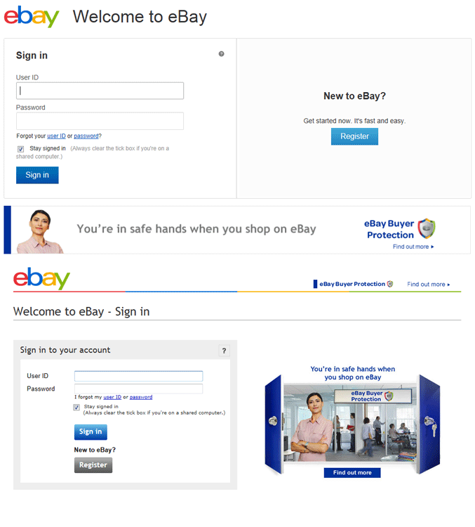
The biggest change is that the picture I’ve hated for many years which promotes Trust and Safety has gone. But don’t worry if the lady in the picture has always instilled a sense of calm and trust for you, she’s still featured but simply been flipped horizontally and installed in the bottom banner with the eBay UK office graphic in the background.
In comes lots of white space with half the page given over to a “New to eBay” and register button.
The thing that gets me is there are only two buttons on the page – a “Sign In” button and a “Register” button and they’re different shades of blue. That’s poor form for a newly design page – school boy error!
I also can’t help thinking that the registration should start on that page – eBay only want five pieces of information – Name, email address, User ID and Password. Why not remove some of the sign up friction by putting the registration form on the sign up page itself instead of being another click away?
Here’s an image of the old page and the new page so that you can make your own mind up. Suggestions for improvements are welcome, although we absolutely make no promises that eBay will even read them, let alone implement your ideas.






One Response
Agree with the comment regarding trust and safety image and message.
This is a negative message giving an impression that ebay is neither safe or cannot be trusted yet is the one constant that ebay repeat on various pages including the home page.
I cannot think of any other website that so heavily promotes the negative.
Why not promote the positive aspects of ebay when you sign in?
Buyers sign in to buy so promote the shopping basket or something that encourages multiple purchases for example.