
A week ago eBay unveiled their latest eBay App version 4 for Android and Apple iOS.
 I’ve been holding back on reviewing it for two reasons – firstly it was a phased roll out and I didn’t actually get the latest eBay Android app until a few days ago and secondly because having read reams of 1 and 2 star reviews for the app I wanted to find out why users think it’s so bad.
I’ve also had the opportunity to speak to RJ Pittman, Chief Product Officer at eBay, who’s been able to share some additional insights.
As a Samsung Galaxy user I’ll be referring to the Android App, I’m sure there will be minor differences to anyone using the iOS version, although App User Interface is now unified across both platforms.
Why the major eBay mobile App overhaul?
One of the things that was necessary was to make a bigger investment and commitment to mobile as a whole for eBay. Mobile is growing at a brisk pace so a big part of the new App was making sure that under the hood the right technology was there to bring forward new features and functionality in the future.
80% of the improvements were behind the scenes changes focusing around speed, security and the ability to drive multiple versions of the App forward at once for iPhone, iPad, Android, smart phones and tablets. The aim for the app is a services to make eBay a multi-screen ecommerce company.
eBay App 4.0 is a giant step in that direction and laying down a foundation for the new shopping and selling experience, able to move very fast to make it customisable and personalisable, version 4.0 is just a stepping stone in that direction but a pretty big stepping stone.
What have eBay done differently
My first impression of the App (and I’m sure partly the reason that there are so many low star reviews) is that it’s very different to previous versions. In the past the app was heavily menu driven whereas the new app is aimed heavily at shopping with graphics playing a major role in navigation.
 If you scroll to the categories tab eBay have replaced text list with beautiful picture menus. There’s been a lot of thought to make the app pretty here so credit where credit’s due. At the top center of the App is the ever present search box so it’s easy to enter the keywords for whatever you want to buy just as you would on eBay and it all appears to work as expected with the ability to refine by category, buying format, brand, item specifics, condition and price.
eBay’s goal is to drive healthy blend of browse versus search and currently the new App has driven three to five times more browsing than the previous version (increase varies by country).
Browsing wasn’t a highly engaged way to use previous eBay apps so it may be an increase of a small number but it is absolutely in the right direction. RJ tells me that buyer activity browsing categories and going across categories by sweeping side to side though the App has seen buyers shopping across other products to their original intent and shopping in more categories.
If the App is increasing shopping activity and exposing buyers to more categories than ever before that has to be a good thing for sellers.
eBay App version 4 testing
Before they launched 4.0 eBay invited forty five thousand buyers and sellers into a public beta – both business and consumer users. This allowed them to get a lot of critical customer feedback and they used a lot of that feedback in honing the final release.
It went very well but that said it takes a little bit of getting used to and adoption challenges and issues that could frustrate many customers was expected. However even after the public beta, when users started waking up to an auto-update it was no surprise that there were some challenges in bringing customers along.
This isn’t even unique to eBay App 4.0 – there was a very rapid flywheel of releases for the iPad release last December that took them from a low rating in the app store right back to well over 4 stars again and eBay are already seeing the App and performance start to stabilise along with the ratings.
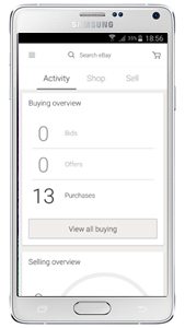 Home screen menus
When you open the App the menu options are now “Activity”, “Shop” and “Sell”, gone is the previous “My eBay” and buying screens – that’s now all under “Activity”. This is semi confusing as the Activity tab shows two Recently Viewed Items at the top (both of which I’ve already purchased), than watched items, followed by a buying overview (useless, I have no bids, no offers and apparently 13 purchases. The section then has a selling overview (Sold, Unsold and 60 day running total of order value) and finishes up with sellers that I’m following.
 eBay have displayed buying and selling activity summaries on cards in this screen, but there’s too little information to be useful. However all is not lost, from the Activity screen you can click into your Buying or Selling activity for pretty much all of the information you’ve been used to seeing in previous version of the app. If you’re not on the home screen there’s a drop down menu on every screen no matter where you are in the app with the same menu options.
“It all looks different” complaint rather than “It doesn’t work” or “Stuff’s missing” complaint appears to be a common complaint but it shouldn’t take too long to become accustomed to the new eBay App.
Portrait / Landscape mode
One justifiable complaint of the new App is that it doesn’t appear to support landscape view with screen rotation. There’s a reason for this and that is that landscape mode was an Android only feature – the new App is unified across platforms.
This is a real pain so sellers take note:
If you’ve still got mobile unfriendly descriptions they’re now often unreadable on the eBay app. If you’ve got a category list down the left hand side of your description that’s probably all I’ll see.
Worst of all if you’ve got fixed width descriptions and the text can’t flow to fill the screen size then buyers now have to constantly scroll side to side in the eBay app to try and read your description.
Of course many buyers don’t bother reading descriptions these days (and who can blame them on the eBay app), so images, titles, categories, item specifics and product identifiers (brands and GTINs) are absolutely essential.
Lack of landscape mode is also a complete PITA when trying to read or reply to messages – especially eBay messages with their rich HTML format!
eBay have this in the lab, for the tablets the App is already in landscape mode but eBay recognise for larger phone formats screen rotation could offer great value. They’ve nothing to announce formerly but are investigating very seriously so watch this space.
On the subject of eBay’s HTML emails not being mobile friendly, RJ tells me that they’re not going to let the messaging team off the hook simply by giving landscape mode to the App. That doesn’t solve the core issue, so eBay are working on mobile optimising eBay messages. RJ says that mobile unfriendly emails are unacceptable and a long standing problem which they’re solving one email type at a time. Even with an email fix however, there are still many reasons that landscape views makes good sense.
Where are the daily deals?
There’s a glitch with the UK version of the new eBay App which means eBay Deals aren’t displaying, or to be more correct only a small subset of deals are viewable in the eBay App. For US users all the deals show, so RJ has the team urgently running down the glitch to fix this. If you’re having trouble finding the deals this will be fixed in the near future.
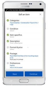 Selling Improvements
Selling is definitely improving through the application making it easier to be able to sell through mobile devices and to encourage first time listers. eBay aim to make the eBay app the easiest simplest fastest way to list something and manage your listings all in the palm of your hand.
The app has grown in complexity however, there’s a standard editor and for anyone that wants to hen peck their way through there’s even an HTML editor if you fancy writing code on a mobile keyboard. Advice with listing via mobile for complex HTML descriptions is much the same as it’s always been – use your mobile to take the photos and start the listing off, save it as a draft, and then complete the listing on your desktop before putting it live.
The big new features you probably haven’t spotted
The upgrade from v3 to v4 for the eBay App was a radical overhaul and in reality was mainly preparation for the future to make the App more engaging, more relevant and ultimately to drive more buying and selling activity.
Across the App are various channels with each set of content held in “cards”. In the future these channels will get much more personalised, the cards are flexible, smart, and can adapt to usage patterns. Users of the eBay App will also be able to customise which cards they see in the future and there’s there’s a lot more to come in the next year.
Now that the framework is in place and eBay have consolidated all their Apps into effectively one, the back end development will only need to be done once in the future and then rolled out to whatever version of the App you’re using, whether that be an iPhone, and Android or a tablet platform. In the past development would have to be done separately for each operating system.
By making all of these changes eBay will be able to put out a lot more features more often, RJ summed it up as “nothing but goodness for customers”.
You can today for your favourite device.


17 Responses
“If you’ve still got mobile unfriendly descriptions they’re now often unreadable on the eBay app”
This requires its own separate topic/news story maybe?
Not happy about this as the suggestion is if a seller is using any form of html template when listing then from an ebay mobile perspective you are shooting yourself in the foot. How do sellers stand with Turbolister and template use in this listing tool? Surely ebay should update Turbolister to ensure that this is mobile friendly, or at least issue warnings if listings are not mobile friendly and, on the face of it, this they appear to have patently failed to do.
The suggestion is this mobile app update appears to make the ebay shop listing frame with shop categories in the side bar redundant. It seems that much of what ebay is about desktop/laptop wise is being mutilated by this push for mobile. Do the ebay mobile division work behind Chinese walls within ebay towers? That is the impression ebay give!
I have now installed the app having hesitated because of poor reviews. Onto an ipad though so not necessarily a true mobile phone experience. Having reviewed the set up I will be making minor tweaks to future listings. Item specifics are essesential and extremely important for mobile. The “additional information” for used items is also extremely important and should include full informstion including a request for the visitor to view the “seller information” link. Also important to use ebay picture hosting. Other than this it is better than reviewers seem to suggest so maybe Amazon sellers are spamming the ebay app reviews!
I was invited to beta test the app, and seemed to work fine! with my glitches and improvements reported.
now its rolled out en masse, it seems slower!
I’m still not a fan. I appreciate its changed, however it’s the layout and structure of all activity (formerly known as my ebay) that’s confusing and complicated – keeping track of items I’m bidding on has become a chore with previously easy tasks now hidden behind menus.
For instance – I want to remove an item I was bidding on that has expired
Previously the process was:
Home screen>my eBay>buying>scroll To item>delete
Now the process is:
Home screen > scroll down past last 2 items I viewed (I was browsing I don’t want these – pointless) > scroll down past viewing > click all buying > click bar at top to bidding not won > delete
Hopefully a new update taking much more of the sensible layout of 3.0’s my eBay and applying it to this, along with some more graphics to help distinguish what’s going on amongst all the plain text.
This traps so much about shopping, but where do shoppers get their products,from sellers! It is very seller UN friendly. Perhaps someone will be driven to create an ebay alternative that’s friendly for sellers.
Both parties must be treated as equally important
“Browse versus search”…this is one of the apps biggest failures, yet you and ebay salute it as great for us. Its navigation/menu structure is equally pathetic.
Go ahead and make improvements under the hood, but don’t make the app nonintuitive and take more steps to do the same thing that used to be done simply. I do not see anything beautiful about this app, I just see empty white space and a waste of space everywhere. I do not like the menu system, I do not like the phoney phrases like cash it in. I will never use the “browsing” experience. I am not going to use eBay valet, so every I see that ad it pisses me off. This was a totally amateur update and the people who worked on it should be embarrassed. I do not like the stock photography that makes it feel cheap and stupid. App used to be well designed and these current designers she go back to either what they had or what their predecessors did
Why don’t ebay develop an app purely for sellers to include sales management and listing functionality?
Rather than trying to produce an all things to all people app split it into 2 apps. 1 for buyers and 1 for sellers.
Upgraded to see what the fuss was and I absolutely hate it.
Hard to read, hard to use, such a dramatic change is very bad, I cant browse and skip through sections how I used to, learning the navigation from scratch is a massive turn off and a lot of users just wont be bothered.
Agree with above comments, white space everywhere and have to click down menus and do lots of scrolling to find what used to be easy to access. Horrid and likely to affect sales dramatically.
As a web developer, I now use the eBay app as a cautionary tale for clients who don’t yet understand the dangers of arbitrarily deciding what is best for their end users. Big distinctions need to be made between minimalist and broken.
I agree with all the above would it do ebay any harm to let users choose which version they prefer to use rather than force a poorly made app . I deleted the app and reinstalled version 3 but it was auto updated back to version 4 within an hour
So this shows that no choice is EBAYS choice maybe a compromise could be a settings tab that would allow us to manually updare when we are ready to
I’ll echo some of the other concerns mentioned. 3.0 was very comprehensive, intuitive and efficient in terms of getting to where you wanted it to go. 4.0 looks dumbed down, is not intuitive to use and is very inefficient in terms of moving around to frequently checked areas. Areas are buried in menus and thumbs and thumbs worth of scrolling. Too much white space omitting previously present info, too big a push for other categories/items I don’t give a Baby Ruth about. My phone updated on the 11th, uninstalled on the 12th. I’ve been checking reviews periodically and they’re consistently bad across Play store and ebay community forums since the roll out. It’s as if the overall design was dreamed up by someone (or some marketing committee) where “pretty” was paramount over function. It’s so needlessly inefficient that it reminds me of the original iDrive in the 2002 BMW 7-series…where no less than 6 steps were required to manually tune a radio station.
To those of you who would like to read actual UNBIASED reviews of this app, please refer to the user reviews where you download the app (eg. Apple App Store). There are thousands of well-written posts by the users of eBay who would object strongly to this article’s positive review. It is unbelievable that no tech website has yet covered the massive panning that actual users are giving this update.
Myself, I’ve been using eBay since 1999, and this is the first time I have ever had a major problem with the eBay interface/experience. The new app has made going onto eBay a joyless headache. I spend much less time (and money) there now. There will be a massive drop in revenues at eBay because of this abysmal app, thanks to the young man (RJ Pitmann) whose self-stated (and self-aggrandizing) goal is to change the way e-commerce done. This episode in business history will join the Edsel and New Coke in the hall of fame of corporate idiocy.
Jeff Bezos and the folks at Amazon are probably still pinching themselves.
RJ seems to be an excellent fit with the current ebay ‘management’ – he clearly knows what everybody wants and if the customers actually want something else, they’re in the wrong! The latest version is far less intuitive than the previous version. As a seller (the people who pay ebay, something they’ve forgotten), I can no longer see my feedback; I still cannot send invoices; the search doesn’t work (I search on the App for my own items, no luck; revert to desktop and hey presto, there they are!).
So many of us are desperate for an ebay competitor to come along, this App only strengthens the case!