There were a number of topics which came up in workshops at the eBay Connect event in Manchester this past week, one of which was listing descriptions and what information and content they should contain for the future.
This is particularly apt with the ever growing number of consumers purchasing on mobile devices coupled with eBay’s earlier announcement to discontinue all active content by 2017.
 There are two schools of thought on the best way to proceed. The first is to dump all listing designs and default to a basic text only listing description. The second is to pay your listing designer to ensure your listings are responsive, mobile ready and comply with all eBay’s latest stipulations.
Text only descriptions go pretty much against all common wisdom regarding eBay selling over the past decades, but their time may be coming. I remember a time when if you wanted a picture on your eBay listing you probably used photobucket and manually inserted the HTML code to display the image. This was before the days eBay introduced gallery images, which if you then used they’d charge you 15p per picture.
Today eBay optimise gallery images for desktop and mobile, give you 12 for free and display gallery images on mobile. There’s very little advantage of embedding images in listings and often they’ll simply make your description slower to load and on a mobile add very little if anything to the buying experience.
Back in the day, if you wanted payment methods, returns information, shipping rate tables, business seller or VAT information it would all be held within your listing description, but today eBay have fields for just about every conceivable piece of data you’d wish to convey to a potential customer so duplicating the same content in your description just isn’t necessary.
Many a seller have created a ton of work for themselves over the years. Many veteran eBay sellers will remember the day eBay ordered them to remove ‘cash’ as a payment method from their listings. With much gnashing of teeth sellers set about manually editing 100s or 1000s of listings (and this was in the days before bulk edit find and replace tools so it was a listing by listing process).
In 2016 it’s time for a listing description to be exactly what it says on the tin – a listing description. No longer should it include any of your selling policies, dire warnings to your buyers about what you’ll do if they dare to leave negative feedback or instructions on how to return an item.
Once your description is just a description and all the superfluous information has been banished to the many fields eBay have created to hold it, you can then decide if you want a text only description or if it’s worth paying a designer to make it look a little prettier.
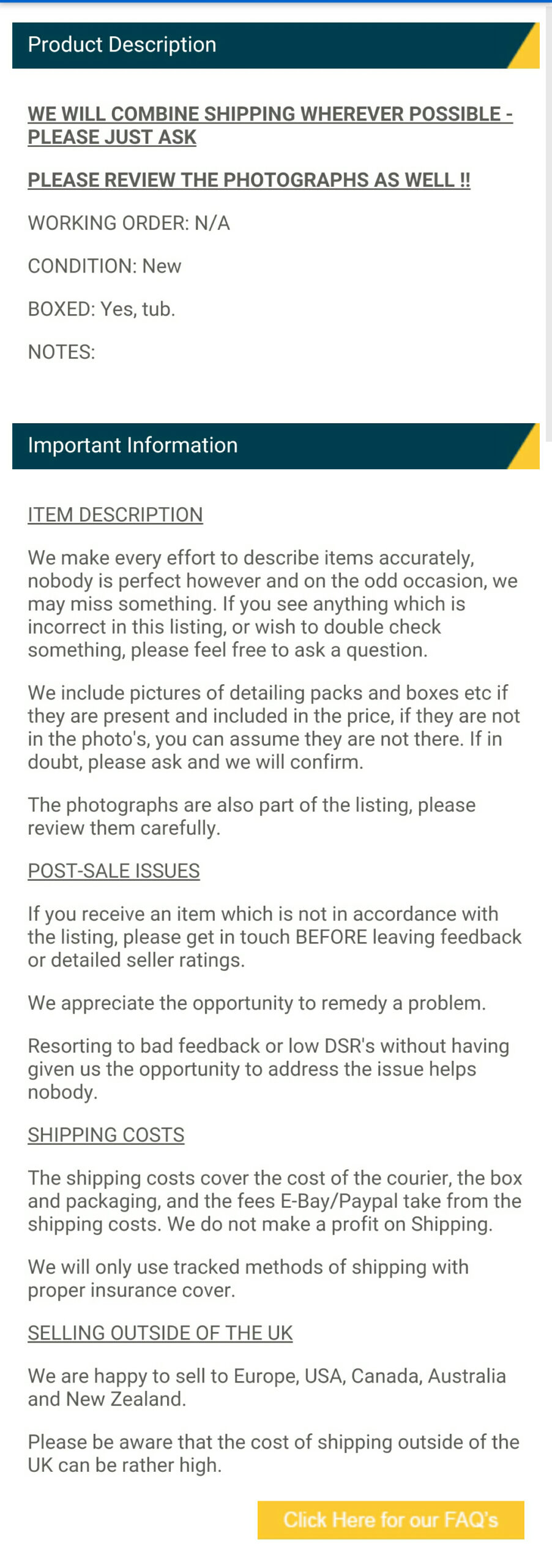 Don’t even bother looking at desktop designs though… the mantra for all design is now “Think mobile first”. Check out what your prospective eBay template will look like on a mobile before you even bother to check out the desktop version and make sure you see an eBay app version as well as a mobile browser view.
As an example I picked a random listing with a rich HTML desktop design, but the designer has done a superb job of cutting this down to a responsive mobile design. The mobile view isn’t text only, but it’s so close to text it’s simple to read and fits a mobile screen perfectly.
There are tons of advantages in having a beautiful branded listing template but most of these only apply to a desktop environment. Pretty much everything you get on a desktop you want to strip out of your design when it comes to a mobile. Designers (you’ll find some in our Tools & Services Guide) can do this for you with a responsive design, so make certain that’s what you get. If not, it may be time to dump all the rich HTML and plump for a text only description.







5 Responses
grasp the nettle
forget about the fluff and flannel simple text with
price condition and facts does the job
Strangely for the sake of “new technology” some aspects of how we use the Web must now go backwards. PC’s, of almost all formats and sizes, present us with a huge, fast window on the world yet, for the sake of something jokingly called a “smart phone”, we have to restrict our information through a bottle neck not seen on PC’s/Web for over a decade.
If you’re a “box shifter” selling, likely, Chinese goods with all the now almost mandatory “pretty numbers and codes” that Amazon and now eBay request you probably could drop all pictures . . and so many of the “templates” used in both eBay and Auctiva are now so dated too . . but what if your produce is bespoke or even quality used?
In those sales FULL photo’s are absolutely essential to ensure you don’t have any issues with “not as expected” complaints . . true? After all, could anyone imagine how useless say Etsy would be with no photo’s?
One step forwards, two steps backwards . . .
As a clothing seller the main thing we have in our descriptions are size guides. Currently these take the form of jpg images embedded into our descriptions. Without these size guides we would be constantly having to answer questions regarding size and fit from customers. I will probably have to look at converting these size guides to text now though, not sure if I’ll be able to get the information over to the customer in the same way as our current size guides. A job for a designer I suppose.
We are kinda lucky in as far as this goes. We use Photos as much as possible. They could do with making subtitles maybe free. All we use is text essentially copy and paste the listing title again and have our T&C at the bottom. People hardly read anything anyway it is a quick scan look at price and click and buy. Then you get the kick off later. We did have a scrolling gallery for years but have essentially just got rid now.
I can see it being a nightmare with clothes etc
“Don’t even bother looking at desktop designs though… the mantra for all design is now “Think mobile first”. ”
And this is what’s wrong with everything.
Just when phones have higher res screens than the average PC, we now have dumbed down websites that should have been around 6 or 7 years ago.
And conversely, we now have website that are vertical in design and look lousy on a computer or a tablet that isn’t rotated to portrait.
The exact opposite is really the case – every site should now be dumping mobile versions as they’re just not needed today, but Google says and eBay jumps.