Businesses spend a lot of time shooting product images for the Internet. Sadly, whilst many great product shots work well on a desktop, they’re not quite as good when viewed on mobile devices. With significantly over half of all ecommerce sales taking place on a mobile, knowing how to design a mobile ready hero image has never been more important.
GS1 UK asked the industry to help develop guidelines for online product images. This is not a new problem and Unilever who worked with the University of Cambridge over four years to compile consumer research and retailer feedback across 17 countries. Unilever donated their research to GS1 as a basis for an industry-led initiative to produce guidelines on how to implement a mobile ready hero image for online retail channels, specifically on small-screened mobile devices.
Whilst much of the focus was on groceries and household items, many of the lessons learnt can be applied to just about any product being sold online. The focus is on the four ‘W’s to ensure that the information on the product and pack size are immediately apparent to the consumer, especially if they are making routine purchases and just need visual confirmation that the product they are looking at is the correct one.
The Four Ws essential for mobile ready hero image
Governed by the Four Ws, the guidelines are a clear set of recommendations for creating consistent product images that allow shoppers to make quick and accurate purchase decisions on mobile devices.
- Who is the brand?
- What is it? – The type of product.
- Which variant of the product is it?
- HoW much of it is there?
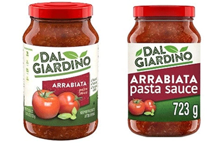
The accompanying image on this article shows two product shots, one is an image of the actual product and the other is an edited mobile ready hero image. On the product shot much of the vital information is unreadable, even on a large screen device. By flattening the image and repositioning the text, the brand, type of product, variant and quantity all stand out giving the consumer all of the information they need to make a purchasing decision, even on a small screen.
Mobile ready hero images will also become increasing important for image search as results are generally presented in gallery format with thumbnails and conveying the critical Four Ws information could make the difference between your product being click on or that from a competitor where the information is clearly conveyed.
Product shots, regardless of how great they are, may be doing you a disservice when your customers are shopping on small screens. If you’re interested in learning more about how to design a mobile ready hero image you can find the full GS1 guidelines on their website.







16 Responses
I wonder how many people need a hero image?
Wouldn’t that be against Amazon image requirements as it is not a photograph of the actual product you would receive? With additional text and logos banned I think it would be a risk.
it could be argued the main product ingredient minimised on the hero pic,
is not suitable,
the time effort and cost of producing the hero pic could be hypothetical,
the difference is obvious when side by side but would it make that much difference in the actual advert ?
were more interested in the tomatoes in a tomato sauce than 723g
such photoshoppery is a perfect excuse for the customer to claim “SNAD” on ebay.
it doesn’t look like the photo = instant refund on ebay, or you paying for a label automatically without a chance to explain these days.
sound advice.
Clearly the second label is better for online especially for food/household items, as you can see the weight and what the actually item is. It is different if you are in a supermarket as products are grouped together where as online it might be displayed in a sponsored ad to catch someone’s eye.
Tomatoes definitely look better in the first image.
Not really a true comparison as the first image is taken at a different angle.
I think if I was shopping for a jar of Dal Giardino, arrabiata pasta sauce the first image would work for me. In general grocery shopping most people know what they are looking for.
Great to see such interest on the new GS1 Guidelines!
Just one point of clarification picking up on some of the points above….the scope of this initial work was grocery replenishment items and for images on mobile devices.
So when consuners are shopping on the move, for products they know (i.e. not the mocked up pasta sauce we’ve used to show the key principles!) the tomatoes are less important than key information we refer to as the 4Ws….we’ll that’s what our industry group told us anyway!
Talking of our industry group, it was predominantly made up of ‘traditional’ retailers, brands and solution providers and we’ve love to have input from those primarily focused on selling on marketplaces.
Please let me know if there is anyone out there that would be interested in any further development work in this space.
Surely the key point should be the packaging design in the first place? The retail marketplace has changed, and packaging design needs to change with it, so clear and concise in a shop, on a pc and on a mobile.
The weight of an item is often disguised so that we don’t question how the size has gone down for the same price.
It would bring greater transparency to the whole market place and ensure the consumer gets what they expect as we all know that online purchases are often made from the first image alone.