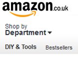
Earlier this month Amazon have launched a new look and feel to the Amazon home page and now they’ve updated the rest of the site including the product detail pages.
Gone is the old blue and orange design and now the whole site is the snazzy new grey scale menu bars with black fonts. There is still plenty of blue and orange, but the even the blue of the Buy Box has been toned down to a lighter shade to match the new look and feel of the site. However most of the buttons on the site are various diverse shades of yellows and oranges so don’t quite match up.
The sign in and account button is much more prominent, alongside the Basket and Wishlist links at the top of all Amazon pages including the new search results page and product detail page.
The site now looks and feels a lot cleaner, although personally it still feels like they have too many different coloured fonts. Black, Green, Burgandy and Orange plus blue for hyperlinks (why blue? Still so 1990’s!) and brown for visited hyperlinks makes for six different font colours which is probably overkill.
Overall though a massive improvement, well done Amazon!
