eBayare using a range of new colour palettes for their iconic logo (Whoop!)
You may have seen them sprinkled around the web in various places without particularly noticing the change, but I love a logo so wanted to find out more, not least of which was to find any lessons that others could apply to their own logo designs.
 Looking back to pre-2012 and eBay’s original but much loved logo, today it looks rather tired and old fashioned. It had to go, but I still have fond memories of it.
When the old eBay logo was replaced there was an outcry across the web, but it wasn’t just a new logo that was announced in October 2012, it was a new eBay and marked a new era for the company under the leadership of Devin Wenig.
 In came a new, a cleaner, and a more contemporary and consistent experience across the eBay site and it also marked the first time that eBay had their own brand new logo, distinct from eBay Inc which at the time still owned PayPal and had their own all blue version of the new logo.
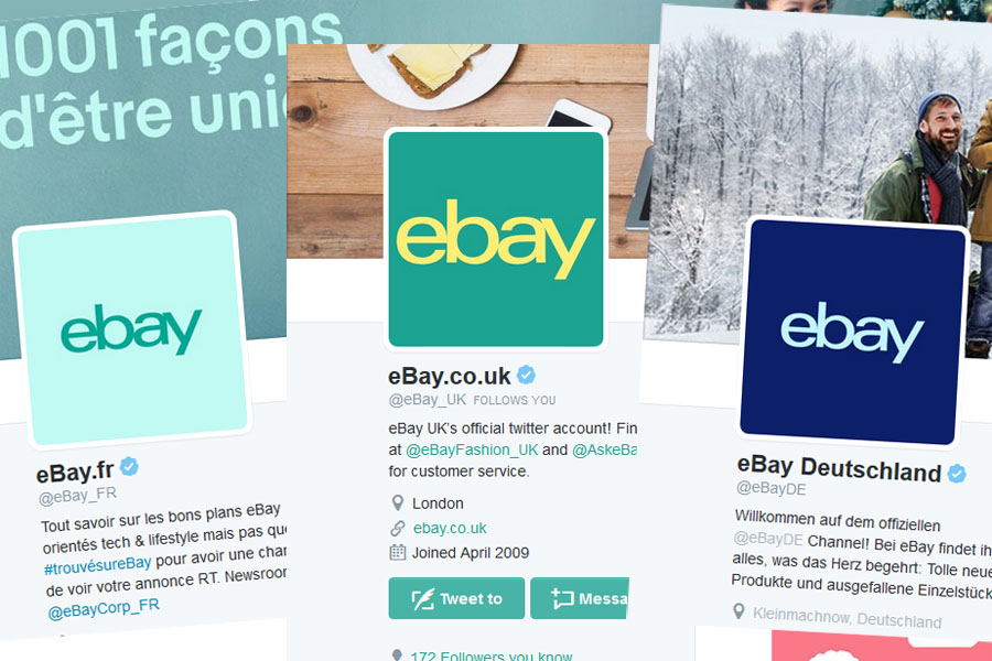
eBay has always been a colourful brand and so as the logo evolves it’s no surprise that colour is central, representing the vast diversity of buyers and sellers and the broad selection of products available on the site. eBay’s latest iterations aren’t so much new logos, more an incremental change giving a broader range of colours which frankly in some situations are a lot more usable then the current four colour logo (For instance when watermarking an image or video. Sometimes you just want a version of the logo which doesn’t clash with the rest of the imagery).
A brand is a tricky concept to nail down graphically, a logo is after all hardly noticed most of the time and yet it can have huge impact. eBay wanted to get across the idea that everyone has their own version of what’s perfect for them – essentially what makes you ‘You’. The new pantone colours are intended to articulate that whilst eBay means different things to different people, it is a vibrant brand and has something for you and that won’t always be the same thing. Sometimes you’ll see different colours and see eBay in a new light.
You’ll start to see the new logos on Facebook, Twitter, YouTube, Advertising and numerous other places both on and off the web. The colour’s aren’t new, they’re pantones of the regular eBay logo palette so are comfortingly familiar even through they’re different and bring a new vibrancy to the brand.
Next time you commission a new logo, take a few moments to think about where you might want to use it. Will it be roughly square (long rectangular logos are always tricky to use on the web). What colours will it be and will it create a good watermark for images? Can you adjust the colour palette for various use cases? Importantly, what does your logo say about your brand?
eBay told us that since introducing the new pantone colours to the eBay logo that it’s been well received, saying: “We got overwhelmingly positive feedback from employees, sellers and buyers as well as other stakeholders”.




![! Social Web Template [Recovered] Amazon Future Engineer Scholarship recipients](https://channelx.world/wp-content/uploads/elementor/thumbs/Amazon-Future-Engineer-Scholarship-recipients-qx1k9h8ihd702da3gf56eb3zfdgmqby55wi2ln5bq8.jpg)


3 Responses
Its a logo….. in fact its not even that its eBay written on a different coloured background.
Money well spent I say why did they not action this sooner! :/
The pedant in me wishes they would change the b to a B to match their name….