Designing a mobile presence requires some basic considerations that will play through to all the specific things you are trying to achieve on mobile. The main things you need to think about are:
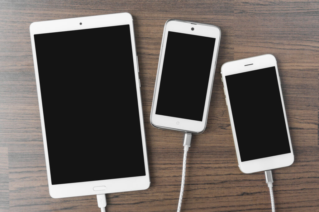
- Size – the devices come with typically quite small and various screen sizes
- Orientation – the device can be used portrait and landscape
- Processing power – typically lower than a desktop computer, although it is improving
- Network connectivity – as we have discussed you need to think about how variable the bandwidth of the devices connection is at any given time and factor that in
- Touch screen – mobiles almost all work using a touch screen rather than a mouse and cursor so design for fingers
Take all these things into consideration and you can start to sketch out the main requisites of your mobile strategy.
How to design an m-web presence
We have already touched on how m-web sites need to consider, perhaps more than any other mobile stratagem, the limitations and peccadillos of the mobile device.
Size and orientation
One of the main considerations when looking at how to render your site on a mobile device is getting it to work across all the different screen sizes that are available out there and the fact that each one can be viewed in two ways. That makes around 120 to 150 different ‘versions’ that you need to get your site to fit.
The main thing to consider is using adaptive and/or responsive web design that will allow you to design a site that will automatically adapt to the device type, screen size and orientation. Making it responsive too, will also help it to factor in other aspects such as location and network issues.
This should help your site to automatically serve up the right image sizes and more in the right sort of structure that will work well on a mobile phone. This may well be a ‘cut down’ version of your ‘full’ website as you don’t always need the same things on your mobile rendering as you do on your main site. As in all things, less is usually more.
Processing power
Designing for the more limited processing power of the mobile device is becoming less of a problem these days as phone processing power and memory get better with every iteration of a device. However, it is worth bearing in mind that rapid – almost instantaneous – downloads are what people want so the principles apply. Keep images small in terms of file size, keep text light and make sure that you m-website isn’t really data heavy as this will slow it down. Lean and clean is the name of the game.
Connectivity
As with processing power, the need to keep the speed of download of your site and all its pages rapid and engaging also applies to the variable bandwidth connections that a mobile device is likely to experience. When building and testing your site remember that it won’t necessarily always be downloaded over a superfast broadband wifi connection or 4G. It may be being used on really crowded public wifi, heavily used 3 and 4G networks that are being throttled at peak time or, even, over a 2G or EDGE network.
Again small file sizes and light text are the order of the day, as is looking at how your responsive design responds to detected network conditions.
Touch screen
Aside from designing sites that are fast to load on low processor power phones and over slow networks, the biggest thing to consider when designing or adapting your site to mobile is that mobile is a finger activated device. The touch screen is build for fingers – some of which may be fat. So you need to make sure that anything ’clickable’ is a button that can easily be hit by a finger and not too close to other clickable buttons and links.
You also need to design the site so that it can scroll just by flicking a finger and that it can be manoeuvered in all directions easily. You also need to work into the design the other touch screen functions available to you such as pinching and two finger gestures to zoom in and out and to flick.
The infinite scroll
Another upshot of the touchscreen is that everyone now scrolls rather than going from page to page, so consider how to re-design your site for the ‘infinite scroll’. This means that you just keep scrolling to get to everything. Of course you can have ‘page’ buttons at the top that will leap you straight to where you want to go, but letting the user just scroll is now part of how people use the web. There is no ‘below the fold’.
And this applies equally to your normal PC website – users are so used to the tablet and phone experience that they now expect this on desktop screens too.
How to design an app
Designing your app takes into account many of the issues raised in designing your m-website (above), however the basic starting premise is different, as we have seen.
Size, orientation, touch screen and infinite scroll issues are all exactly the same on an app as with an m-website: the design has to work in the same way on the same screens after all.
Where things differ with apps is that apps are usually a much richer experience and can be much more involved and complicated. The processing power of the device has an impact on design, but ever improving RAM and processor power means that apps can now be quite rich , complicated experiences with many things build in to them.
Online apps
If you consider apps being used when the device is connected to the web, then you can design it so that the latest data is pulled down frm the web when the app is opened. This allows for apps to be refreshed every time they are used, which gets you round the endless approvals procedures from app stores. It also keeps the experience tailored to the user using it.
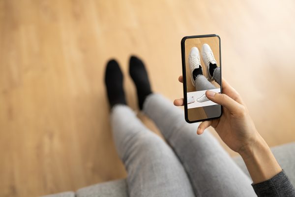
It also allows you to do all sorts of clever things such as location based marketing and services, functions such as barcode scanning of goods (for showrooming, reverse showrooming and stock checking – and to buy things that are out of stock in store online), store locators, and more.
They also allow you the retailer to push messages to consumers which allows you to enter into a two dialogue with them and help build brand experience through instant messaging and offers.
Offline apps
Of course apps may also be used when the device is not connected to the web – such as on a plane (for now) or when the user has very power coverage. Here you need to tweak your design to so that it offers as many of the features as possible from the online version so that it can still be of use. If particular note here is that you should allow people to put goods in their basket when offline and, when the app connects next to the web, to keep that basket live so that they can they buy it.
In-store apps
Many retail apps are increasingly featuring an in-store mode that can log them into the retailers wifi and help the retailer send targeted offers based on the user’s profile and their location in the store. It also features in-store locators (maps of the store in essence) and many other features.
