There are so many ways to skin a website. Here we round off our look at how to build a website with a look at some of the best of those we’ve come across. Why not send in your examples?
You can learn more in Section 1: Start of the DIY ECOMMERCE GUIDE
So in no particular order… here are our favourites (and why)
The Ancient Mariner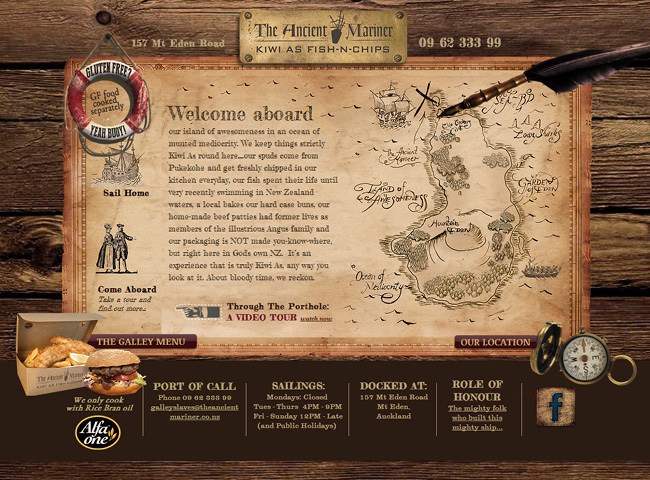
A New Zealand restaurant that has nailed its nautical theme to the online mast. The design echoes the theme of the restaurant, but is also within that is still really clear as to what you can do on the site – and features the food too. Great example of brand style and ease of use.
Lena Medeiros Art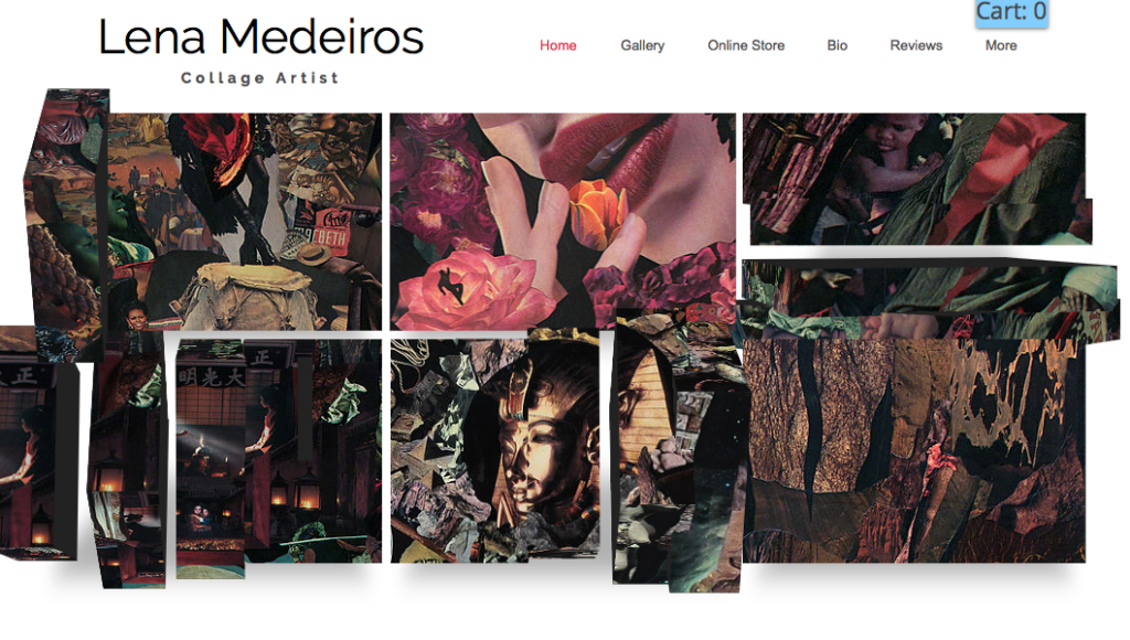
Hard to capture in a photo, but check the site out as it uses stunning 3D moving images to make it enticing and captivating. In keeping with being an artist, the site is also mysterious and begs you to delve into the minimalist design – a design of site that compliments rather than detracts from the beautiful and complex art works.
Pencil by 53
This natty stylus company features a beautifully clean design that is easy to navigate and use and really shows off the product. It features an infinite scroll for mobile use – it looks really ace on a tablet – and, if you keep scrolling you can see the insides of the stylus come out as you scroll. This alone does it for me.
Kutoa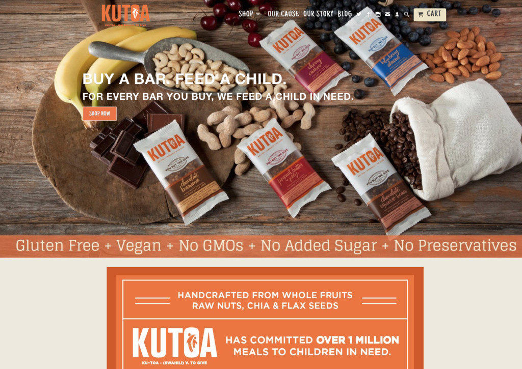
“Buy a bar, feed a child” – this site is for the healthy nut packed Kutoa health bar that relies on sustainably produced chocolate and nuts which supports children in Africa. The site is clear and concise and mixes well the message of the organisation with the deliciousness of the bar. Preachy and peachy if you will.
Dropdead
The ultimate in animated ecommerce websites, this fashion site scrolls past you so you don’t ahave to even move your mouse. The punky cut and paste design of the images is a neat counterpoint to the thoroughly modern scroll. Lovely design, lovely website. Really cool.
