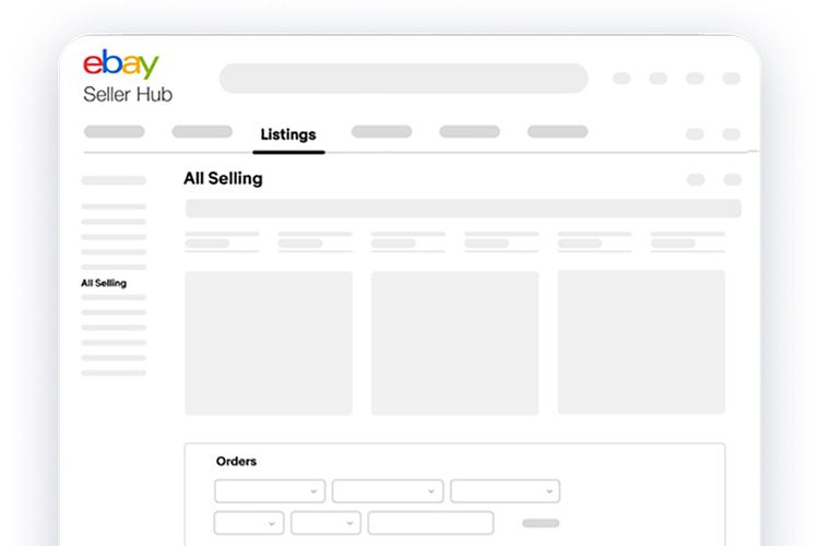
eBay are slowly moving all selling activities into Seller Hub, and now it’s time for the long served classic All Selling Page to move.
As with all changes to the way we do things, this move will cause annoyance to some, although eBay say that everything you need is now in eBay Seller Hub – you’re not supposed to lose functionality, but you might have to do things in a different way including click a different link to get to where you want to go. Rather than clicking through My eBay to get to the classic All Selling Page, you’ll click on Seller Hub.
Once the migration from the classic All Selling page goes ahead, you will find your active, sold and unsold listings, as well as your drafts, on the new All Selling page in Seller Hub.
The biggest change you will notice, is that rather than a table format on the All Selling Page, Seller Hub is a bit spruced up and you’ll be looking at a dash board rather than something that looks like it was designed in the last century. And in fact that’s secretly one of the reasons that eBay are moving away from the Classic All Selling page, it’s running on very old code and it’s holding eBay back from developing new features. All the time the old code has to be maintained then any new dev work as to take into account both the new code and the old code. Dumping the much loved All Selling Page might wrench the heart strings for those that have used it for decades, but in the long run it’s a good thing to get rid of some of the clunky code from yesteryear.
Sellers will be gradually moved to Seller Hub over the coming weeks, but you don’t have to wake up to a shock one morning when everything unexpectedly changes – you should see “Switch to new selling overview” message at the top of the classic page which will enable you to road test Seller Hub and become accustomed to it in your own time (and yes, for just a few weeks you can switch back).


9 Responses
The new seller hub does NOT have the same functionality. To send invoices combined invoices with the correct postage I now have to have two screens open and a pen and paper. Other aspects are now missing altogether. They’ll continue to get complaints until they sort this out.
ne is rubbish change back to classic
I want the old classic view. This one I can not add any note.
I was forced off the classic view yesterday. Although I’m already slightly acquainted with the current one, it’s not as practical in a lot of respects. Previously I could easily see everything on one page, including sales over a 60 days period. Now I have to generate a sales report to know where I’m at.
I also have to open new tabs to see items that are awaiting shipment vs those already shipped, which I also find a lot less convenient.
It’s the same for scheduled listings – before it was all on the same page, now I have to click another link to see those.
All in all a lot less convenient.
EBay made this change and it looks like some “intelligent” person designed the new move. I’ll take the basic classic look for it’s usefulness over this new design any day. Change for change sake shows a lack of wisdom.
Seller Hub truly is BAD. I am a Top Rated seller with a store subscription. Now I am close to leaving eBay for good. I want the Classic All Selling Page back that has everything you need all on one page. Why would eBay want to ruin a good thing. The way I see it is that if this is the way eBay wants to run things their way and ruin a good thing. I think its time for anybody that might own stock in Ebay to get out. Sell as fast as you can. If this is the way they run their site and force all Sellers to have to use Seller Hub. Its time to run to the hills. Sell Sell Sell eBay stock before they ruin the whole company.
Seller Hub is AWFUL, I hate it. That is not because it is new, it is because it is so bad! I cannot see everything on one screen any more. To find out if I have sold anything I have to actively move to another tab. I am not a commercial seller, I only sell a couple of things a week but have done this for 20+ years. I do not need all the extra functionality of the Seller Hub – at least let me customise it to only display the things I need/want.
What with this, the new non Paypal payment system and the fee increases, it is getting harder for me to justify using eBay anymore. I will soon be an ex-eBay user!!!
Another failure.
eBay is eating itself and losing buyers and sellers
Please please eBay put the CLASSIC back the easy to use not your New Sellers hub. Honestly I struggle to find the address of my buyer the other day and I didn’t even see the PayPal transaction EBAY you really made it so hard for us seller and buyer to do transactions in this New Seller hub. I’m using 2 account that i used to enjoy to use but I might just quit and close it all. YOU’RE GIVING US HARD TIME EBAY WITH YOU NEW SELLER HUB.