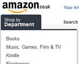
Amazon have launched a new look and feel to their home page. Gone is the familiar orange and blue menus to be replaced by grey. They’ve also got a lot more “white” space than previously.
Currently the home page features a Kindle advert, which is the center of five Amazon properties highlighted – LOVEFiLM, Amazon MP3, Kindle, Amazon Apps and Audible.
I like the way that the sign in and account button is much more prominent, alongside the Basket and Wishlist links. Lower down the page are Popular Searches, Recent History and other product suggestions Amazon believe you may be interested in.
It’s a shame really that this is just a home page makeover, currently all Amazon product pages still have the familiar blue and orange menus, but I’m liking the new home page design a lot. It does make the rest of Amazon look a bit 1990s, whilst the home page is most definitely well into the 2000s. I’m looking forward to when they revamp the rest of the site to match.
Thanks go to Innovation Inception (trading on eBay as ) for spotting the change


7 Responses
Long overdue. Looks better, but they should have gone further. Like I know better than Amazon. Hahah hahaha!
Noticed this cropping up a while back, must have been testing it.
Love the new look though.
I’m guessing they’ve just changed the home page so they can monitor what impact it has on SEO. Then there will presumably be tweaks and minor adjustments before they implement updates to the product pages. All this of course is just supposition! 🙂
Nice homepage tweak, but quite UNBELIEVABLE most of their internal pages are from the 90’s!
they could have squeezed a bit of cookie compliance into the new page though.