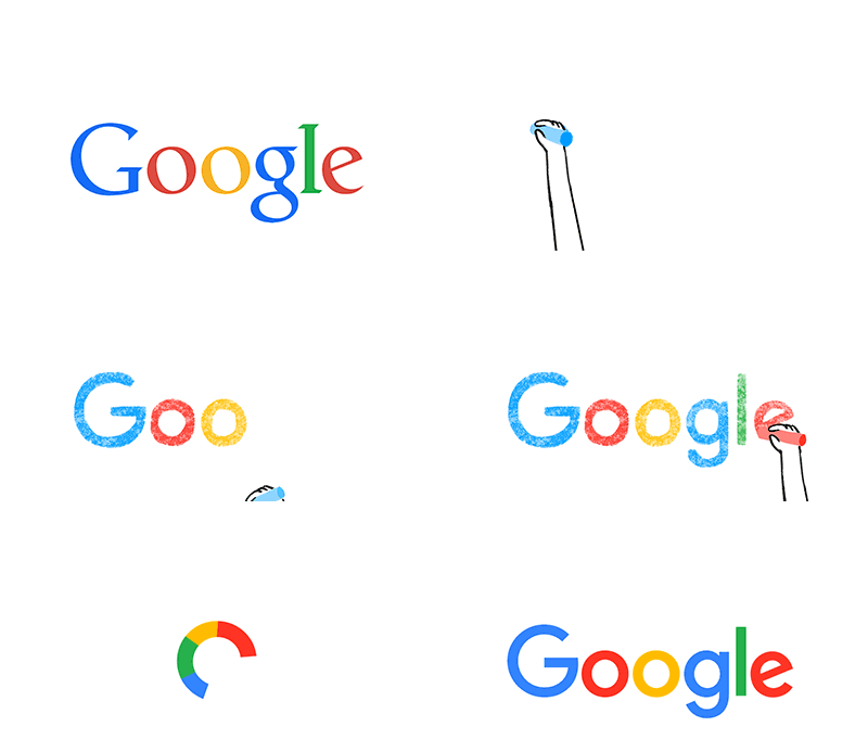
 Google have unveilved a new logo which they say is a great reflection of all the ways Google works for you across Search, Maps, Gmail, Chrome and many others.
One of the key requirements for the new logo was to make it work on low resolution tiny screens and yet still be pixel perfect with no blurring. Google say that they were once “a destination that you reached from one device: a desktop PC. These days, people interact with Google products across many different platforms, apps and devices—sometimes all in a single day. You expect Google to help you whenever and wherever you need it, whether it’s on your mobile phone, TV, watch, the dashboard in your car, and yes, even a desktop!”
Gone is the Catull font and in comes a brand new font, Product Sans, designed specifically for Google. As well as a new logo, Google will be replacing the little blue “g” icon and replacing it with a four-color “G” that matches the logo.
What do you think of their rebrand? To me it’s very reminiscent of eBay’s new logo, although for Google the letters don’t touch. Do you like it, hate it, or simply don’t care?





6 Responses
I’m not a huge fan – it feels particularly conformist for a company that historically has gone against the grain.
About as exciting as a book stall at a traction engine rally
I like how they ‘poke’ the letter E
its clean and will work across more devices, im actually surprised they didnt do it earlier.
and lets face it, even if it was the worst logo in the world.. it would still be recognised as google, and wouldnt deter.
Why blue red yellow, blue green red?
What is their thinking with this colour order?