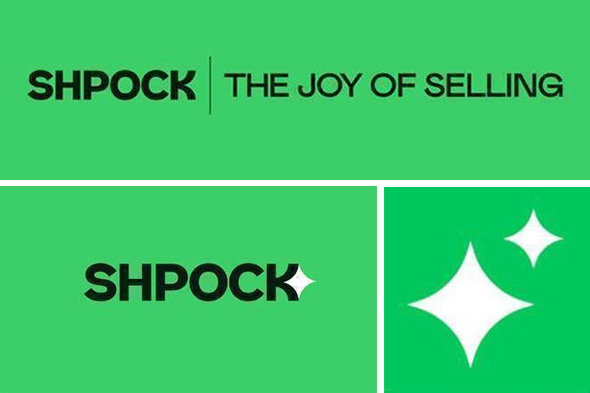
Shpock are launching a rebrand today, including updated messaging and fresh logos. The new brand is currently rolling out across the Shpock mobile app and website and will underpin Shpock’s core communications and The Joy of Selling messaging.
Shpock say that their branding introduces a bold and confident look, designed to stand out as one of the UK’s top marketplaces.
“Developed in conjunction with Koto, Shpock users can expect a fun, enthusiastic and self-assured tone from the brand that reflects its evolution from a local classifieds board, to a UK-wide transactional marketplace.
Shpock’s new look is designed to reflect the joyfulness that Shpock users feel when they use the platform. Buying and selling second-hand is a great for you, your wallet, and your planet. It brings a smile to your face. Or as Shpock calls it: The Joy of Selling.”
– Shpock
Mature and ready for the future
This year has seen the introduction of a range of new features that pivots Shpock to a UK-wide transactional marketplace. Buyer protection, secure delivery, and payment within the app now mean that users can buy and sell securely to anyone across the country.
Shpock is no longer a local-only boot sale upstart. With millions of active users across the UK and Europe, Shpock requires a brand that reflects its scale and maturity. Moreover, as the brand looks to secure an even wider audience and become the go-to trusted transactional marketplace, Shpock’s new look will allow it to make an impression.
Selling as a business on Shpock?
Shpock also have a business seller offering with a Shpock+ Shop to display an unlimited amount of products, legal terms, link to shop website, and contact details. Here at Tamebay we know a few sellers who have investigated Shpock for commercial business to consumer selling but none that have jumped in successfully. If you’re a business selling at scale on Shpock we’d love to hear from you.
The Joy of Selling
Alongside a fresh logo and visual identity, Shpock’s new brand spirit is manifested in its new tagline: The Joy of Selling.
“Shpock is the best place to sell items online, so it’s no wonder Shpock users feel so happy when they sell through the marketplace. What makes Shpock different? On Shpock, it’s free to sell (there are no fees for sellers), it’s safe to sell (payments can all be made in the app) and it’s fast to sell (UK-wide delivery means more buyers and faster sales).”
– Shpock
Shpock’s new logo is designed to stand out. Key to the redesign was the need to increase memorability and recognisability. By ditching the joined-up handwriting in favour of bold, easy-to-read letters, Shpock’s new logo makes an impression, from the phone screen to the outdoor billboard. The new logo also reflects the latest design trends of clarity and minimalism; a true brand for the 2020s.
The new, bespoke font to accompany Shpock’s rebrand was developed by Colophon Foundry and will soon be seen across the app and website.
Shpock users will soon see a lot more of the Shparkle, Shpock’s fun and lively visual ident. Some users might have already seen the Shparkle as it replaces the existing app icon on their home screen. The Shparkle is a visual manifestation of the joy Shpock users feel with every transaction. Shparkles will be used throughout Shpock’s visual assets to add light-hearted and playful moments.
“Shpock has seen big changes this year, and as we evolve into a transactional UK-wide marketplace, we need a brand that reflects our new position in the market. Our vision for Shpock is to create a fast, safe, and trusted marketplace, and with our all-new look, we can communicate what makes Shpock so special. From our bold new font to the fun and playful Shparkle, we think our new brand will bring a smile to new and existing users as they experience the joy of selling.”
– Esteve Jané, CEO of Shpock
