Last Christmas eBay.co.uk made a radical decision. Rather then revert to the old home page when the Christmas season was over they unveiled a completely new home page. The eBay.co.uk home page has set the standard for other eBay sites around the world who have replicated the look and feel but eBay.com has been one of the last sites to follow suit.
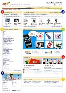
 Now eight months later eBay.com has launched their new homepage at the same time combining it with a snapshot of “My eBay” activities. This is great for buyers and occasional users of the site as it brings their recent activity into view on what’s to most casual users the eBay landing page.
For established sellers the changes will probably go largely unnoticed. Most sellers have their eBay shortcut set directly to “My eBay”, and for most to the selling tab – they have little interest in visiting the home page.
For buyers the “Watched items” is a feature sellers should appreciate, buyers are reminded of the items they were interested in bidding on. The selling tab with just five items on view is a needless waste of space for all but the most casual of sellers. The reminders tab again is useful for casual buyers but pointless for sellers, there’s no point eBay telling me I have x number of feedback to leave when it includes a load of transactions that haven’t even been paid for! It might as well just be for buying reminders.
That might sound slightly negative about the homepage from a sellers perspective, but I still like it! Buyers are the most important commodity that eBay has and tailoring the home page to buyers is just what eBay should (and have) be aiming for.
Sadly eBay.com haven’t had the courage to scrap the home page featured section, the eBay.co.uk home page is much improved by not being filled with get rich schemes or spoof listings designed to rip buyers off.
If you haven’t already have a look at the new home page demo, or even better just log into eBay.com and see it in action for yourself!


