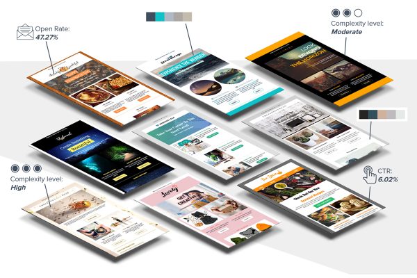
iContact have just published an infographic that answers virtually every question you might have ever had about email marketing.
If you’ve ever wondered how many emails you should be sending your customers each year, how your campaigns compare with industry standards; or just how effective email marketing might be for your business, this infographic has it covered.
What is especially interesting, is the comparison between email marketing and social media, it appears that consumers much prefer email marketing newsletters to communications on Facebook or Twitter.
Has your business benefited from email marketing? If you’re not already doing email marketing sign up for a 30 day free trial from iContact and start testing in the run up to Christmas. You may be surprised at the results.


2 Responses
Shows the power of email in great detail should do others.
and heres me thinking the phone is the way forward LOL