As announced in the eBay UK Spring 2013 Seller Release the visual experience on eBay is changing and some of the changes are rolling live to site today.
eBay are aiming to deliver a cleaner, more contemporary look and feel to provide a more intuitive and convenient way to browse and buy across all devices. We’re looking forward to The Feed rolling out on eBay UK, but in the mean time expect to start seeing changes to the eBay Home Page, Search, My eBay and member to member communications pages. You’ll also already be seeing the new eBay sign in page which has been rolled out to 100% of users.
eBay Home Page
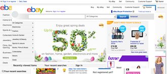
You may be familiar with some of the new pages as eBay have been running tests. Once you see the new eBay Home Page the first thing you’ll notice is the new slimmed down eBay header. The “Buy” tab has gone (thankfully taking with it the link to the eBay Partner Centre where the tumbleweed continues to blow apart from a link to Shiply and the BMW eBay shop). The Buy tab also takes with it the link to browse categories, shopping tools, eBay mobile and safety center.
Old eBay and New eBay Home Page
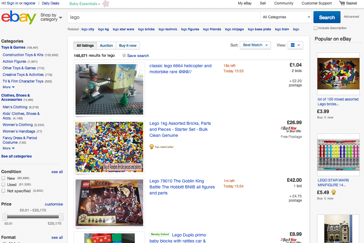
New eBay Search Page
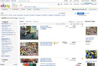
The one thing that we know on Tamebay is that sellers get worried when eBay tinker with search results. We’re happy to confirm (other than the normal ongoing tests) that the search result page changes are purely cosmetic, it’s just a refreshed look and feel with lighter colours which have the effect of giving more emphasis to images.
Old eBay and New eBay Search Results Page
You’ll notice that the updated header is carried across to the new search result page, it will also be on all other pages on eBay in due course.
Don’t forget that these cosmetic changes are just part of eBay’s move towards bigger, cleaner, clearer images. Whilst the image size itself isn’t changing in this update images are becoming more important on eBay and will become even more prominent when the Feed comes to the UK. With up to 12 images free on all listings from August, now is the time to start updating images to ensure you’re ready for the new cleaner, more contemporary look and feel eBay are moving towards.
eBay are determined to drag the site experience out of the 90’s and be one of the most streamlined ecommerce site in the world. Whilst many of today’s changes might appear minor they’ll have tested, tested and retested to find out just which colour and shade in which position on the page results in the most sales. If it’s good for sales it’s good for me (plus it does look good too!).





9 Responses
Is ’embiggen’ a word?
.
ebay PLEASE NOTE:
Could you make the coloured line [Was bright yellow] that appears if you add notes or buyer leave a messages in ‘My eBay: Summary/customers orders’ DARKER as it could easily be missed using the very light shade now employed.
.
and,
CAN WE PLEASE HAVE THE INDIVIDUAL SEARCH BOX BACK [TOP OF listing, PAGE NEXT TO MY EBAY LINK] AS THIS REMEMBERS PREVIOUS SEARCH ITEMS STORED IN THE BROWSER.
Without it we have to re-enter each search, every time.
Have they rolled out the stealth immediate payment thing today too? I was told by eBay while buying a new dress that ‘someone else might buy this before I pay’ but the seller didn’t SEEM to have it on immediate payment as the listing normally tells you.
My World’ has been replaced by ‘Profile’.
Unfortunately they forgot to include the link to my ‘Trading Assistant’ page – I have informed them twice without success and now, when I want to see MY OWN PAGE, I have to go via the Advanced Search page link… just to find myself! What a joke.