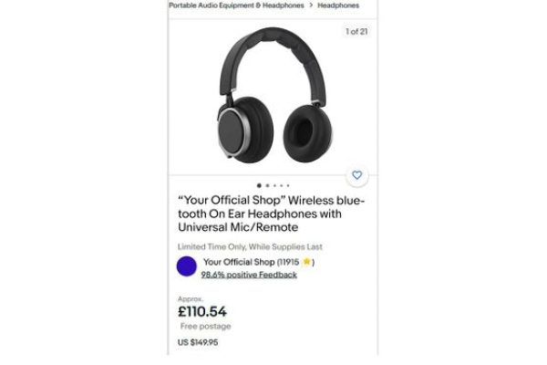
 eBay have changed the way that postage is displayed on the site with the removal of the tabbed Postage and Payment fields previously just above item specifics and replaced them with links in the upper section of the listing.
I can understand the reasoning behind this – the old postage tab was below the top section of the listing and I’m pretty sure that many buyers (myself included!) rarely read the seller description and make a buying decision based on the title, picture and price information along with the sellers feedback score.
 However it does make displaying additional postage services, prices, discounts for additional items less visible for buyers. Having got used to the tab it was easy to see and checking if the seller offers a cheaper or expedited services was simple. Now instead there’s a only small link to click (either the “Change quantity on fixed price multiple item listings or the “View more postal options”) which opens a pop up box to display the additional postage information.
This isn’t great for buyers browsing the UK site but wanting you to ship overseas – to see international postage options buyers first have to click the “View more postal options” link and then click another link for “Change location” to display a drop down of country locations.
 Just in case you’ve already forgotten what the old tabbed view looked like here’s a reminder.
So what do you think? Did you prefer the old tabbed view on the view item page or do you like the new link with the pop up? Possibly most important of all have you experienced any increase or decrease of questions for buyers regarding postage rates since the change was introduced?
Edited to add: We’ve heard from eBay that this is a test originally for a few users but currently running as a site wide test. They’re hearing feedback from users on what’s good and what’s not so good but expect normal service with the tabbed postage information to be restored soon.


15 Responses
Just discovered this this afternoon and I don’t like it.
As a buyer it is messy and too easy to miss the the clicky link and yes, as a seller I have already been asked for overseas postal costs when they were listed.
I loved the tabed system – my P&P questions virtually disappeared over night, especially from International buyers.
This looks like a real headache waiting to happen
For us, the biggest problem around postage is a buyer making their purchase…THEN sending a message saying:
“need this for Saturday, do you have a faster postage option, I don’t mind paying any extra”
My reply should be “then read the bloody listing you dumb numpty”, however I usually manage to put something a little less confrontational together.
eBay needs to make and additional services, such as 1st class, next day etc really stand out. This way the buyer can choose and the seller stands a chance of providing a good service.
we like it, clean sharp and obvious
lets be honest you could smack a lot of buyers round the lug with your options and they would still miss them and send an email
and if their browsing the uk site and cant work out the international shipping their daft and we dont want them
all international buyers browsing the uk site need to do is enter their shipping location in the
change location link and abracadabra its obvious!
what we can see happening with this, is that you can put what you like below the line ,though its going to be missed
buyers are going to ignore all the frills pictures and waffle, in fact most wont even know its there
This will work great, with the new poastge names, when they take effect lol!
Why the change? eBay just seem to be changing some things for the sake of it, is this supposed to be an improvement. Same info put in a different place in a slightly different format and not obvious either.
It’s all very well for regulars on ebay, but why the change, it’ll only cause confusion for casual buyers wondering where the hell the P&P info has gone.
its the non regulars their aiming at I would think
all the info in one place easily found in a smart phone friendly format
James (pink) has stated on the PSB that this ‘test’ is to be discontinued and the P&P tab restored.
This is some what is was like before the tabs came in but with improvements on the original – I say keep it – its easy for buyers to use and most EBAY buyers dont understand what tabs do and how to use them, they shop on ebay as its easy but they would never shop on any ones elses website as they would find the whole basket thing a nightmare, at least 50% of ebay users struggle to use a computer, so simple is good.
We sell in very high volumes and from some of the questions we get – for example today, customer wanted to buy some notebooks and asked did we have a buy it now price (we only sell on buy it nows) why did the customer ask this – they think ebay is an auction site – do they understand ebay – NO.
Make everything simple and easy to use keep to tried and tested systems.
So a big NO to Tabs